Monday, August 22, 2011

Call for Submissions for New Online Journal


About

The Orris is a digital space for the critical and creative engagement of culture. We seek a sustained study of culture in its many manifestations. From the arts to sciences, humanities to technology, our studies are linked together by the common pursuit of knowledge.  This journal features critical and engaging pieces, which uphold the research standards of academia, yet seek to extend intellectual conversation beyond the university.  Interdisciplinary in the most radical sense, this journal allows the disciplines to intermingle, and as the traditional distinctions between disciplines fall away, we seek to find new avenues of critical and creative engagement across knowledge areas. We believe that the pursuit of knowledge should be accessible to all, and hope this journal, in content and form, serves that principle.

Submissions:

We are seeking submissions for critical essays and creative works.  We believe that the ‘long form’ essay has a place online.  Well researched and argued, the long form recognizes the historical scope, the contemporary significance, and the future potential of ideas.  We are open to a range of subjects and approaches, but wish to emphasize we are not looking for the typical academic essay, but rather a hybrid of 'high' and popular culture, a mix of journalism and analysis, a blend of critique and entertainment. We are also seeking original creative works in any medium and style (photography, prose, poetry, comics, video, music, etc).
To submit: Send us a 100-250 word pitch of your article idea, or an excerpt or sample from your creative work.  Send to theorrisjournal@gmail.com.

Monday, June 27, 2011

The Enchanting Tree of Life

tree-of-life-movie-trailer.blogspot.com
I saw Terrence Malick’s Tree of Life this weekend at the Coolidge Corner Theatre. Since its release, this film has gained both its admirers and its critics.  At Cannes, it both won the prestigious Palme d’Or and was booed by some audience members.  I’ll state right off the bat, this is not a movie for everyone. It is a non-linear, messy, quiet, and slow film. Do not expect a classic Hollywood plot where everything is tightly scripted and easily resolved.  Malick’s film is less of a story, and more of an experience.  It can be difficult. But it can also reenchant you with the world.

The film is composed of multiple stories, bound together by the subject of life.  To tell these stories, Malick’s camera brings you into different stages and forms of life. One part of the film looks at the lives of a Texas family in the 1950s. You watch as the three boys in the family grow up, living under both the care and abuse of their father, played by Brad Pitt, and the adoration of their mother, Jessica Chastain.  You follow them through summertime adventures through the woods, through fights with parents, through the tender moments of familial love.


http://tree-of-life-movie-trailer.blogspot.com/
This family’s story is paired with an epic journey through the universe.  Malick gives us a glimpse of the enormous and the microscopic.  Malick’s directorial eye is lyrical as he leads the audience through constellations, nebulous clouds, dividing cells, and growing underwater organisms. He shows us the core of the earth and the edges of the sky.  In this tour of the universe, Malick places the human experience in perspective. Our lives become infinitesimal in comparison of the scope of this grander order. As Malick places the O’Brien family’s loss and grief within this universe, you begin to appreciate the wonder of human existence, especially because of its marginal place in the larger scheme of things.  Malick’s film mediates on the order of life, and it asks you to consider these mysteries yourself since Malick will give audiences no easy answer to his film’s logic or message.


There are moments when this grand tour invokes a state of awe.  It is an affective experience, as you feel your way through the memories of a childhood and the life of a world. 136 minutes long, after a while your eyes do begin to tire after such visual concentration. Like his previous work, Tree of Life is a richly visual film, and is best seen on the big screen.  After leaving the theatre, the film stays with you, making you see the world anew, each color more saturated, each sensation fresh. You are left with a new sense about your life, and I think this is Malick’s ultimate aim. 


Saturday, June 4, 2011

Flash Forward Boston: Contemporary Photography


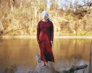
Blind in a Red Dress- Jinyoung Kim


Yesterday I scoped out the Flash Forward Festival down on the waterfront in Boston. Flash Forward is an contemporary photography festival showcasing emerging artists from the US, Canada and the United Kingdom. Sponsored by the Magenta Foundation, a Canadian publishing house for the arts, and juried by respected editors in the photography community, Flash Forward showcases "the work created by the very best emerging photographers." Housed in the Fairmont Battery Wharf Hotel, the event considers the state of contemporary photography through its various exhibits and panels. I attended a panel on marketing strategies for photographers hosted by seasoned pros and editors in the field. This talk, like many on their schedule, considers how photographers can network together to create a vibrant community of artists who actually make some money.  The practical approach to these talks is refreshing as it recognizes the financial necessities of artists today, and empowers artists to more actively manage their own careers.  

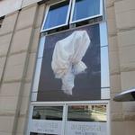
Though the exhibit is somewhat strangely housed in a unfinished restaurant retail space, the artwork is worth checking out.  Wander outside the main exhibit space and you'll find a collection of self-published hand-made photobooks and outdoor installations on the side of the Fairmont Hotel.  While you're there, pick up the free Flash Forward catalog, a 250+ page glossy photobook of all the Flash Forward photographers. The festival and all its events are free and open to the public, and are in town until Sunday night.  Walk through the North End down to the wharf and check out this interesting event!

Check out their full schedule of events.

Thursday, May 19, 2011

Transparency and Anonymity: What's your digital persona?

I've been learning how to use the Internet lately. Or, to be more specific, I'm learning how to use the Internet professionally.  How does one craft a professional persona online? And what is the value of doing so?  In part, these questions have much to do with the transparency vs. anonymity debate that is becoming increasing pressing in our digital age. To what extent do we want to claim our online activities?

As a college instructor who teaches a course in professional writing, I often tell my students to be aware of their digital presence. What shows up when I google your name?  What does your public Facebook profile look like?  To what extent do our digital profiles shape our perceived professional identity?  It seems to depend largely on the availability and access of your personal information. Raising the question, what do you choose to share in the digital realm, and in what name?

Personally, my Facebook profile is very limited publicly.  Only friends can see my personal information, photos, status updates, and shared content.  I have chosen this social media platform as a personal identity, one that allows me connect with friends and family.  But, as I work on developing myself as a writer, I must consider how I use my Facebook for professional ends.  For example, this blog post will be shared online and published in the newsfeeds of my friends. Increasingly, I must recognize my emerging dual persona, as Lana, friend, and Lana Cook, academic and writer. I am accountable for what I say because my name is attached to it.   Facebook requires individuals to validate their real identity by providing their personal information.  According to their policy, FB "requires a real date of birth to encourage authenticity." Facebook requires a certain transparency on their site, so even if you change your display name to a pseudonym, the content is still linked with your real name. Facebook founder Mark Zuckerburg believes
 "History tells us that systems are most fairly governed when there is an open and transparent dialogue between the people who make decisions and those who are affected by them. We believe history will one day show that this principle holds true for companies as well, and we're looking to moving in this direction with you" (Facebook Blog)

Facebook's own transparency issues aside, I believe in this statement. There is a real value in holding individuals accountable for their statements and actions. We become more responsible citizens, more careful friends, and more critical scholars when we know our statements are being known and judged by the public.
I've chosen the path of transparency on Twitter and Reddit as well, using my full name when communicating and sharing information. But in this choice, I am very aware of how I must manage the use of these accounts.  I must consider how what I say on Twitter and Reddit shapes my professional identity, one that is very much tied to my real name and my emering professional persona.
 
The debate about transparency and our use of real names online arises out of the predominance of anonymous discourse on the Internet.  On forums, discussion boards, wikis, chats, we are often anonymous, using pseudonyms for our log in names (if we log in at all).  This anonymity allows us to view, comment, and share information without personal association. If transparency is on the side of democracy and a free and open community, where does anonymity fall?  Anonymity does not require us to be held accountable for our statements and actions online, which seems to have a dual effect. Anonymity gives freedom to both Internet trolls and whistle blowing activists. When I can post anonymously, I feel free to say whatever I want, no matter how potentially offensive, racist, bigoted, inaccurate or misleading.  But anonymity also means, I am free to protest and criticize without personal consequences. This freedom is especially important in repressive states where citizens are unable to criticize the government (or corporations in the global capitalist state) because of fear of persecution. Anonymity can be as crucial to the functioning of democracy as transparency. Consider collectives like WikiLeaks and Anonymous, they would be unable to promote state and corporate transparency without a necessary amount of anonymity. In the debate of transparency vs. anonymity, we need to consider these less as an either/or, but see the necessity of both.  Returning to the case of my professional identity, I'm beginning to increasingly see the ways I can use anonymity to share content and information that I may not necessarily want linked to my professional digital imprint, like my health, sexuality, religious or even political beliefs.  Whether posted in the name of Lana Cook or anonymous, I hold myself personally accountable for what I say (I don't want to be a troll).  As we increasingly share content online, we will need to address how our identities are marked online and the role transparency and anonymity has in shaping our knowledge and governing our communities.
 
For a quick (but too simple) breakdown on the transparency / anonymity debate, check out this graph by Namesake:
Namesake.com/blog
Transparency? Anonymity?  What's your digital presence like? Share your thoughts!

Wednesday, May 11, 2011

Coming out as a Digital Academic

The object of the book is changing. This has happened before.  Bounded manuscripts replaced the papyrus scroll. From stacks of bounded paper, we turn to the e-book. In this digital age, we are experiencing the written word in new mediums: online, on phones, via Kindles and IPads.  As the technological medium changes, we should consider, how might this shift affect the content of books and our human relationship with these forms?
I come at this question from an academic’s perspective. My job over the next couple years is to write and publish a scholarly book. As I prepare for this task, I must pause to consider what it means to write and publish a book in an age when many of my generation read and engage predominantly online.  When I imagine my dream book, it is a multimedia project that includes images and streaming video in addition to text. This is not possible in the print form. Yet, the emerging forms of e-books suggest that this multimedia form is not only plausible, but welcomed by a large reading community online.  But, would my imagined e-book receive credit in the academic community?  Would it help or hinder my academic career?  The answers to these questions will inevitably change and it is my hope that by the time my book is ready for the press, the academic atmosphere has warmed to digital mediums of publication.

Friday, May 6, 2011

On Design

As some of you may know, I am working on a new online journal.  Myself, and the members of this project, have been sharing our favorite online journals and blogs.  Sharing these sites, we’ve been considering their content, style, and design, and trying to get a sense of what rhetorical and design strategies work in the online sphere.  It’s been an interesting process as I try to apply the critical eye to my favorite online spaces.  What do I value in a website?  What do I like to read online? How do I feel about a site’s design?
 
Design is perhaps the most unfamiliar terrain for me. I have always enjoyed the visual arts, have taken my fair share of art courses, and like to dabble in the world o’ crafts.  Yet, I find my ability to critically assess design is not quite up to speed with my ability to tear apart a student’s paper or a scholar’s book. The sticky part about assessing design, for me, is the way good design can seem both highly present and nearly invisible.  Consider the many objects around you, how often do you notice the design?  Typically, it seems we notice design when either:  1) it goes wrong and the design is flawed enough to disturb your use of the object, or 2) when the design is visually impressive or presents something ‘new.’   There seems a duality here. Design should be visually present and invisible at the same time. How is this possible, and how do we use this understanding to assess and create design in our own world?

Yesterday, I watched the documentary Helvetica on Netflix Instant, which considers the history of the font Helvetica and its impact on our contemporary sense of design. 
http://www.helveticafilm.com/images/sm.frankfurt.jpg
The film features interviews with several typographers and designers who each talk about the ways they perceive the design of Helvetica and its effect on our collective imagination.  The film features a range of responses, from designers praising the font’s “neutral,” “modern,” “efficient,” “streamlined and fresh” appearance, to others who criticize that same “slickness” and suggest that its ubiquity in the corporate world creates a conformist atmosphere in our design culture.  But, despite these contending views on Helvetica, the documentary illustrates how design “invites open interpretation,” “allowing us to attach meaning to it.”  This point shows both the possibilities and challenges of design.  How do we design for a vast range of human subjects?  How will we tailor our design to suit the meaning and purpose of our journal?  These are challenging, but exciting, questions for me as I begin to enter this new realm of digital design.

Share your thoughts on visual design. What websites do you admire for their design? Share the links! 

Thursday, May 5, 2011

Review: Cindy Sherman: A Retrospective

Sherman, Cindy. Cindy Sherman: A Retrospective. New York: Thames & Hudson, 1997. Print.

Amazon.com
Looking through a retrospective of Cindy Sherman’s work is a strange journey through the photographic history of American identity and perception.  Cindy Sherman:  A Retrospective (1997) begins with Sherman’s series of Untitled Film Stills, images she produced throughout the late 1970s.  In this series, Sherman dresses up in different outfits, makeup and wigs, and photographs herself in a variety of locales and situations.  Nearly all the photographs depict only Sherman, but seem to imply a human presence just outside the frame of the photograph.  In this unseen, but palpable, presence, there is an implied narrative action to the images.  In each image, Sherman performs the role of a film heroine, and we, as spectators, are invited to fill in the film’s narrative around the image. 

Untitled Film Still #3
moma.org
As many scholars have noted, her performances recall a cinematic history of black and white early Hollywood, film noir and B horror movies.  If a film still serves as an advertisement for the full length film, what does Sherman’s Untitled Film Stills advertise?  As art critic Arthur Danto points out, “the still must tease with the promise of a story the viewer of it itches to be told” (4).  In Untitled Film Still #3 and #50 seen here, Sherman’s gaze toward a presence out of frame suggests such a story, but leaves the viewer to construct that narrative.  Sherman plays with the viewer’s relationship to the represented female identity in each image. We are implicated by how we construct narratives around represented images of the female subject. 

Untitled Film Still #50
moma.org
In the 1980’s, Sherman continues her performance work, but along with her turn to color photography, Sherman’s images become increasingly grotesque and disquieting.